
Projects

Onboarding experience design of a faith-based investing mobile app
Sanctify is is a newly emerging investing app initiated by our client IWP Capital. Help users invest with ethical purposes by checking on the background of relevant listed companies
Project Type
UX contract project, Mobile App, UX & UI design, Prototyping, Usability test, Hi-fi
Business Goal
Helped the client improve the conversion rate and decrease the drop rate.
My Contribution
User Interview, Ideation. Persona, Prototyping, Usability test, UI Design
Duration
Jul 2022 - Dec 2022
*Sanctify is awarded as the Red Dot Award: Concept Design 2023.
OVERVIEW
Project Context

Fintech apps have become game changers in this revolution -- they simplified payments and put financing at our fingertips.
A web-based screening platform is utilized by IWP Capital's financial advisors to evaluate whether the stocks/funds align with Catholic values. Sanctify aims to attract new users with easy access on mobile, and to expand user from Catholics to all faith-based investors
OPPORTUNITY
Project Challenges

High drop-out rate in the current MVP testing
Sanctify’s current MVP testing with five potential users shows that the onboarding process is too long (09:30min), and three out of five users hesitated to offer their information after signing up. The drop-out rate is 60%.
Challenge 1:
Learn about investing domain knowledge
No one in the design team has direct investing or financial professional knowledge. To understand the domain knowledge and user needs, we have done extensive research, including reviewing professional reports.
Challenge 2:
Collaborate with non-tech background client
Client is a traditional financial company and this is their first efforts to develop an app. Without a PRD, we need to the right questions to reveal information. We educated clients about design process and drafted PRD with support of client.
Challenge 3:
Design delightful illustrations in a short frame of time
Used open source illustrations and made adjustments.
DESIGN APPROACH
Process
We aligned the client team to follow an iterative design process in which designers focus on the users' needs in each phase. The design teams met and aligned with the stakeholders throughout the design process.

RESEARCH
A Faith-based Investor

Insights form User Interview
Users would like to spend less time creating a new account and onboarding the product.
Users are concerned about trusting a newly emerging financial app and protecting personal info.
Users want easy access and a pleasant visual style in the app.
RESEARCH
Competitive Analysis
Based on the design scope from the client, our team conducted a competitive analysis and a couple of stakeholder interviews for initial insights. I researched similar successful fintech products on the market to learn about why users choose them.
I identified the conceptual design principles with input from the client. A good onboarding experience can be measured in the dimensions of Visual Quality, Process Length, Company Promotion, Security Level, and Information Collection. I condensed the core design measurements and show the data visually.

Detail Competitive Analysis


Insights of Competitive Analysis
At the same time, I examine comparable thriving fintech offerings on the market to discern why users gravitate towards those products. I deconstruct the notion of an excellent onboarding experience and structure it based on Visual Quality, Process Length, Company Promotion, Security Level, and Information Gathering, distilling numerous key design factors that impact the onboarding journey. Design principles of onboarding experience:
An appropriate process length with the necessary information collection
A chance for the company to demonstrate their crucial features
Multiple information and identity protection measures
A vivid and pleasant interface appearance
DESIGN APPROACH
Design Scope
Redefine Onboarding Experience
Designing the onboarding experience for users to do purpose investing with an app is our main task for this project. Given the characteristic of financial apps, an extra amount of information needs to be collected during the process, making users more likely to give up halfway through and enhancing the difficulty of creating a pleasant onboarding experience.
"68% of consumers abandoned"
Signicat’s Battle to Onboarding report has found that 68% of consumers abandoned the application process of a financial service product - meaning that financial service providers lost an estimated €5.7 billion during the onboarding process.

How might we create an encouraging, secure, and attractive onboarding experience for users?
New account
sign up
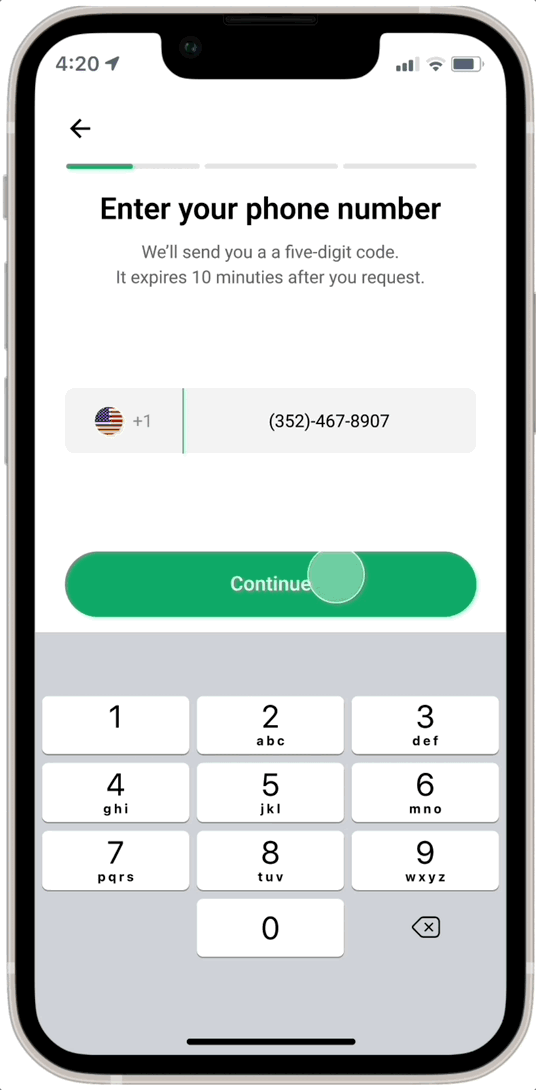
Cell Phone
Verification
ID
Verification
Risk Profiling
Questionnaire
The above four core functionalities are from team discussion and alignment with the client and are intended to be included in the final onboarding process.
DESIGN APPROACH
User Flow
1st Round - New User Onboarding

Insights from User Flow
Insight 01
How might we help users get started with the process?
Begin with simpler tasks (basic details) and include a welcome & introductory page that makes new users familiar with our product and fosters trust. Introduce transition pages that indicate the user's position in the onboarding journey.


Insight 02
How might we help users address financial query demands with confidence?
Consider if we provide users a chance to exit the process, allowing them "finish it later" to complete the remaining steps. Implementing verification techniques can help diminish feelings of insecurity.

Insight 03
How might we help users fully understand the process and make their own choices?
Our design goal is to make users feel that they are not forced to use the service. We want to build trust with users by providing opportunities to get familiar with the process and to make their own choices.
User Flow Updates - New User Onboarding

DESIGN APPROACH
Iteration
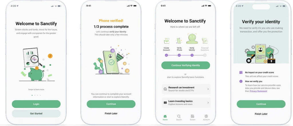
01 Onboarding Process Breakdown
“The process seems too tedious to me. I have no idea if I want to finish it.” - Participant 4

Before
Users merely observe a finalization alert after concluding the whole procedure, possessing reduced clarity regarding the duration of the process.
After
The procedure will be separated into three phases. A full page succeeds each to mentally offer users a feeling of accomplishment.
02 Encourage Users to Complete Risk Profiling Questionnaire
“I know this is necessary. But I feel tired answering these questions” - Participant 3

Before
Several queries are displayed on a single page, allowing visitors to scroll through and complete them. This can lead to the perception of a large amount of data being gathered.
After
Decreasing the data concentration by distributing queries across multiple pages and improving legibility through incorporating visual components and reorganizing the entire structure.
03 Multi-methods of Verification Key Screens
“I feel it's not easy to understand such sensitive info and procedures.” - Participant 2

Before
Traditional authentication techniques are integrated within the procedure.
After
Various validation techniques to enhance user versatility in options and boost security standards. Moreover, we incorporate supplementary clarification of the validation objective and strategy, improving client confidence.
04 Blending In Promotion Opportunities
“I may need more chances to learn about this product.” - Participant 1

Before
Single sign-up / login page with limited information about the product.
After
Extra welcome pages with vivid illustrations help users learn about the demonstration of core features to start their journey to faith investing with Sanctify App.
05 Visual Quality of Interface & Design System
“I would be drawn to visual aesthetics in a pleasing onboarding experience.” - Participant 3

Before
Comparatively subdued saturation and darker hues in the backdrop can cause boredom among users.
After
An increased saturation level enhances the new color scheme, generating a more vibrant visual experience. Crucially, it makes users feel comfortable to use.

DESIGN SOLUTION
Hi-Fi Prototype

Build trust at the beginning
Elaborate the value of Sanctify and establish trust right away.
Allow users to "Finish it later"
Prevent the enforcement of information collecting, and avoid causing users overwhelming.
TAKEAWAY
Impact
The new onboarding experience design launched in Feb 2023. Users can join the waitlist.
During A/B testing, the avg. onboarding time dropped from 9'30" to 7'15", and the drop- rate decreased from 60% to 20%.

sanctifyapp.com
Over 3,000 new users joined
the waitlist within 90 days of
the beta release launch
REFLECTION
Takeaways
Collaborate more, as well as usability test more
To provide a confident and smooth user experience, enhanced collaboration between design and engineering teams is needed to improve the transition to the main features. Conducting more usability testing and interviews would also be valuable in understanding user needs and aligning with their preferences throughout the design phases.